Create Responsive Web Page Layouts Easier Than Ever Before!
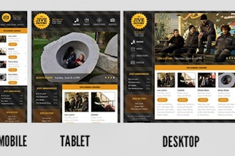
CSS Flexbox and CSS Grid are two powerful ways to layout content in a webpage. Flexbox and grid are newer CSS layout technologies aimed at making it easier to create responsive layouts that are optimized for any size screen.
You’ll learn how both techniques are useful, and when to use each. You’ll also learn how to use Bootstrap (which uses Flexbox) to rapidly code up pages without having to write as much CSS.
If you’ve been coding CSS but don’t know flexbox and grid yet, it’s time to learn them! They enable you to create layouts that were either impossible to build previously, or they empower you to build layouts more faster and more easily than before.
This course has a Prerequisite: Students should feel comfortable coding HTML and CSS equivalent to our Web Development Level 2 class.
Learn more about Flexbox, Grid, & Bootstrap at Noble Desktop.


 CourseHorse Gift Card


