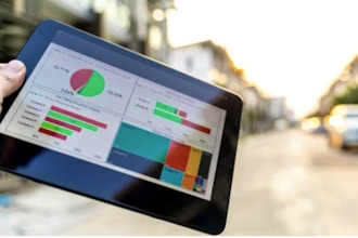
Learn to create visualizations including box and whisker plots, dual axis, and combination charts. Create and edit calculations, use parameters. Tell a data story with dashboards by creating a dashboard framework and implementing actions. Create trends, distributions, and built-in forecasting.
Course Outline
1. Going Further with Visualizations:
- Connecting: Join vs. Union
- Tooltips and Annotations
- Histogram
- Combined Axis vs. Dual Axis
- Adding a Callout and Image
- Interactive Dashboard
2. Calculations and Parameters
- Groups
- Calculations
- Parameters
- Ad Hoc calculations
3. Improving Dashboards
- Using actions: Filter, Highlight, URL
- Implementing actions to tell the story
- Customizing dashboard layout for different devices
4. Forecasting and Building a Story
- Average line, reference line
- Clusters
- Using Tableau’s built-in forecasting
- Dynamic Sets
- Creating, customizing and presenting a story
- Changing the background
- Using Tableau Public
This course is available for "remote" learning and will be available to anyone with access to an internet device with a microphone (this includes most models of computers, tablets). Classes will take place with a "Live" instructor at the date/times listed below.
Upon registration, the instructor will send along additional information about how to log-on and participate in the class.


 CourseHorse Gift Card


