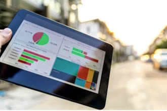
Find out how to build effective visualizations and dashboards. Learn how to quickly connect to data sources; build useful calculations; build data visualizations including bar & line charts, geographic maps, scatter plots, dual axis charts, and tables; build dashboards; share with others. Learn how to create and present stories.
Course Outline
1. Getting Started with Tableau
- Tour and Terminology
- Connecting to data
2. Creating Data Visualizations
- Text table, Highlight table, Area chart
- Line & Bar charts
- Sorting & Filtering data
- Formatting data
- Working with Date Fields
- Calculated Fields
3. More on Connecting to Data
- Data Interpreter
- Understanding Joins
4. Working with Maps
- Assigning a Geographic Role
- Maps with Grouping
5. Creating Dashboards
- Best Practices for Dashboard design
- Formatting Dashboards
- Floating vs. Tiled objects
- Making your Dashboard interactive
6. Share your insights with a Story
- Recap on building Visualizations
- Use those Visualizations in a Dashboard
- Create Story Points from your Dashboard
- Explore Layout Options and present your Story
7. Sharing
- Tableau Server, Tableau Online, Tableau Public
- Tableau Reader, Print to PDF
This course is available for "remote" learning and will be available to anyone with access to an internet device with a microphone (this includes most models of computers, tablets). Classes will take place with a "Live" instructor at the date/times listed below.
Upon registration, the instructor will send along additional information about how to log-on and participate in the class.


 CourseHorse Gift Card


